

Clutch ‘1000’ 2023

The Design Village is a design school with a strong, progressive pedagogical approach. TDV sought a new individualistic communication strategy design that reflected the institution’s commitment to unparalleled design education and a global outlook through a design program emerging from India.
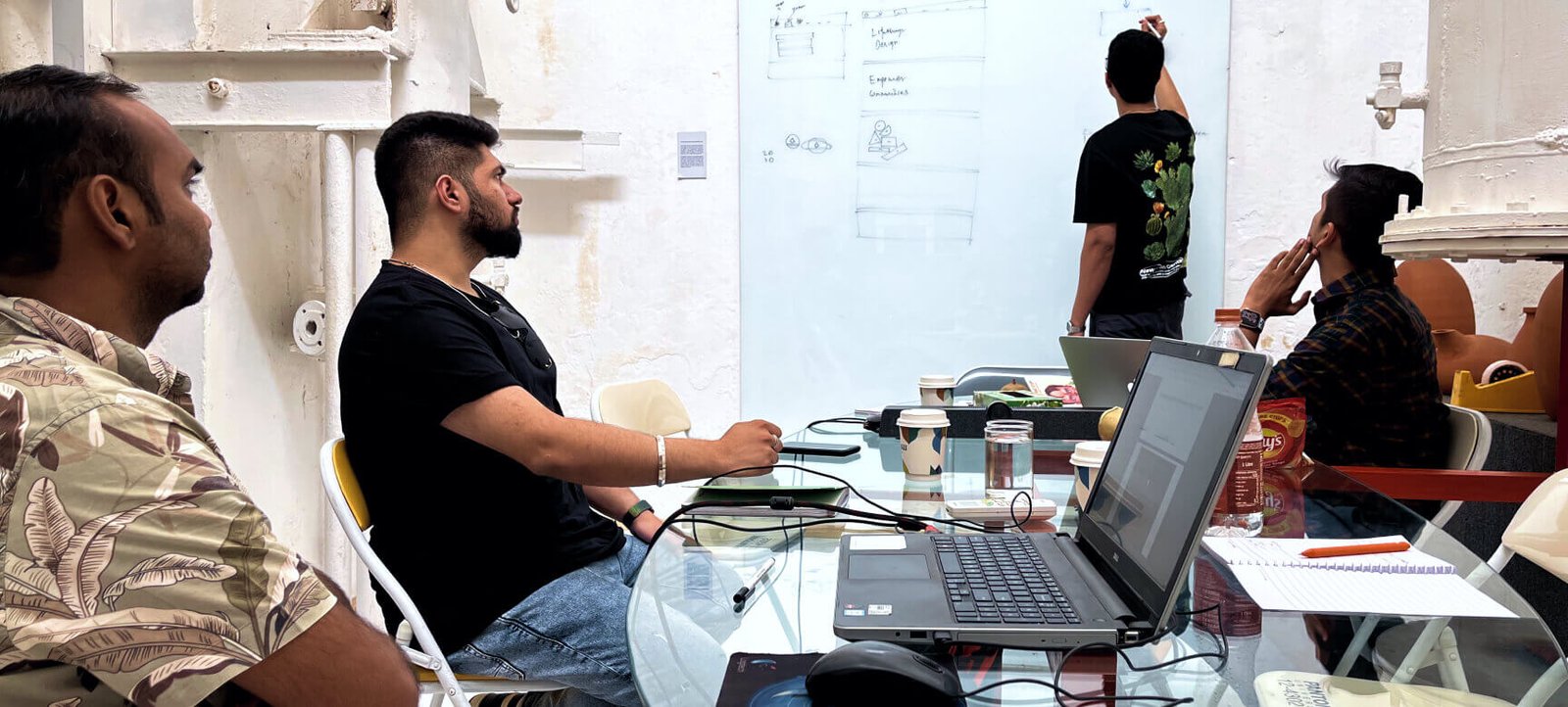
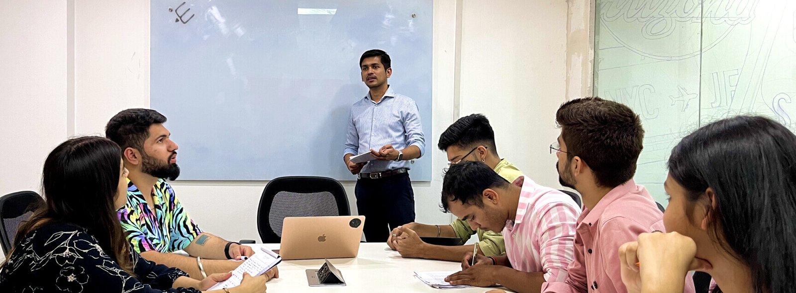
The second section of your case study — commonly referred to as the Context and the Challenge — is designed to provide your prospective client with a detailed description of the context that led to the creation of the project. If it’s well-written, the reader will leave with a solid understanding of the environmental factors and problems that you were hired to solve as a designer.
We took a methodical approach to first understand TDV - their core, and also the brand perception across stakeholders to come up with a comprehensive brand strategy. Based on the brand values, we articulated our brand communication as well as a visual identity that could help them stand out in our competitive landscape.
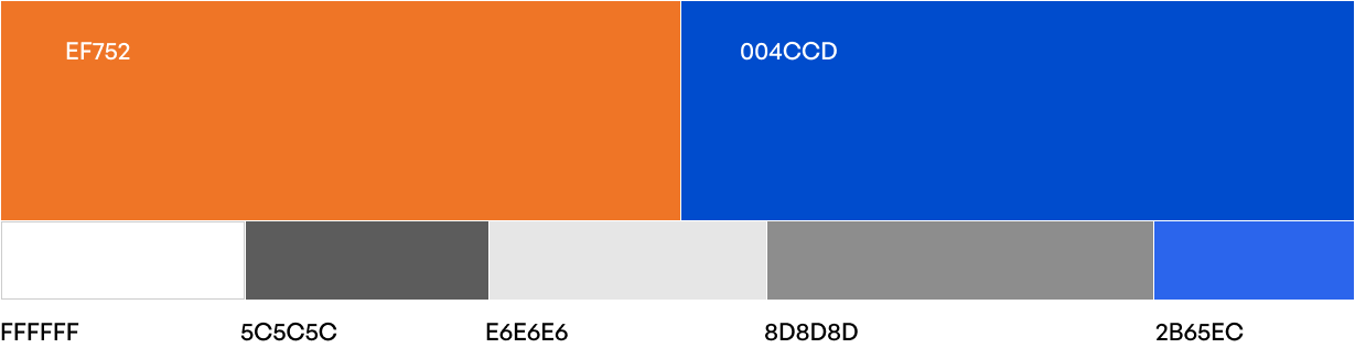
The three words that best describe our selected palette for TDV. As we know how colours have their own subjective significance, our aim was to create a website experience that triggers the right emotions.
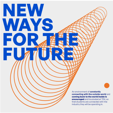
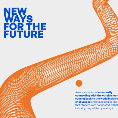
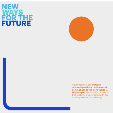
Orange being the brand colour it also represents passion and motivation whereas the blue is for the belief TDV is entrusted with.
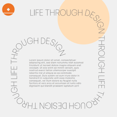
Keeping in mind the minimal theme for this brand, we used only one typography that creates a balance with the brand visuals with the structural yet neat form

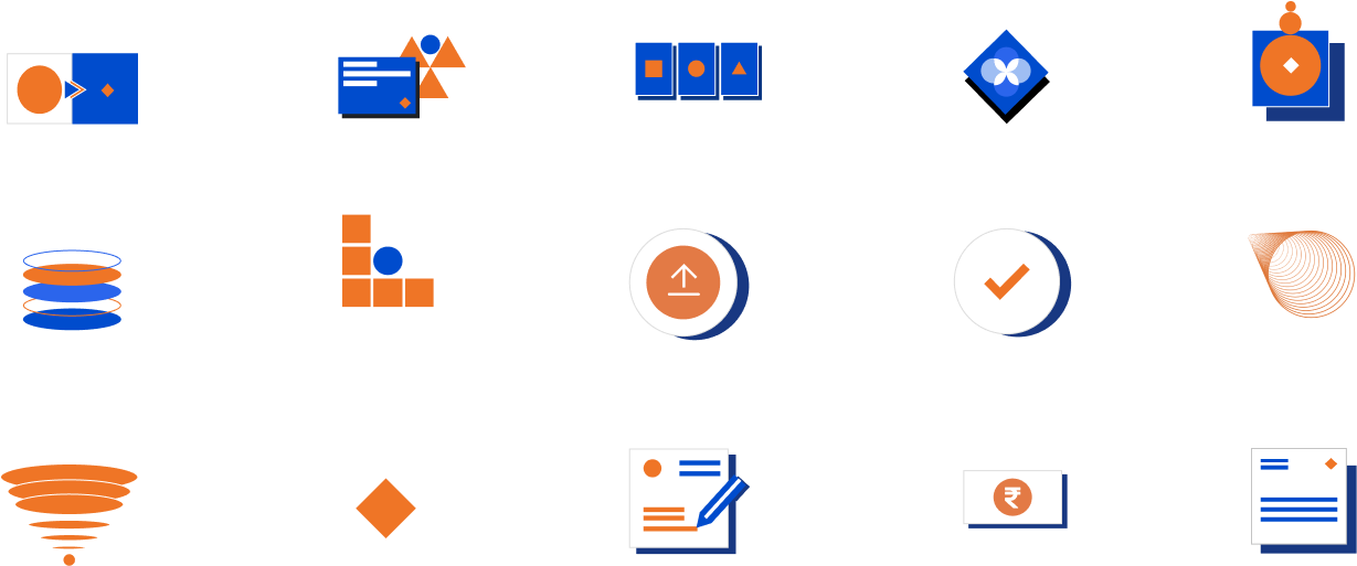
Being a Design College, what else would represent the brand assets better than shapes in its core form. Keeping in mind the diamond of the Logo, we created all our shapes and vectors around that. Hence, keeping the minimal and impactful theme that we wanted to achieve.
A content-first approach brings together designers and writers. Our content writers were were aware of the website’s end goals, got a picture of the content that’s needed to meet those goals. Had a look at existing content and see if there was anything missing or unclear.
A content map was created for the flow of content, especially in a CMS. Content maps helped us with the specific content that went on each page and how those ideas related to the larger whole. The information architecture has a more solid foundation when the content was already organized.
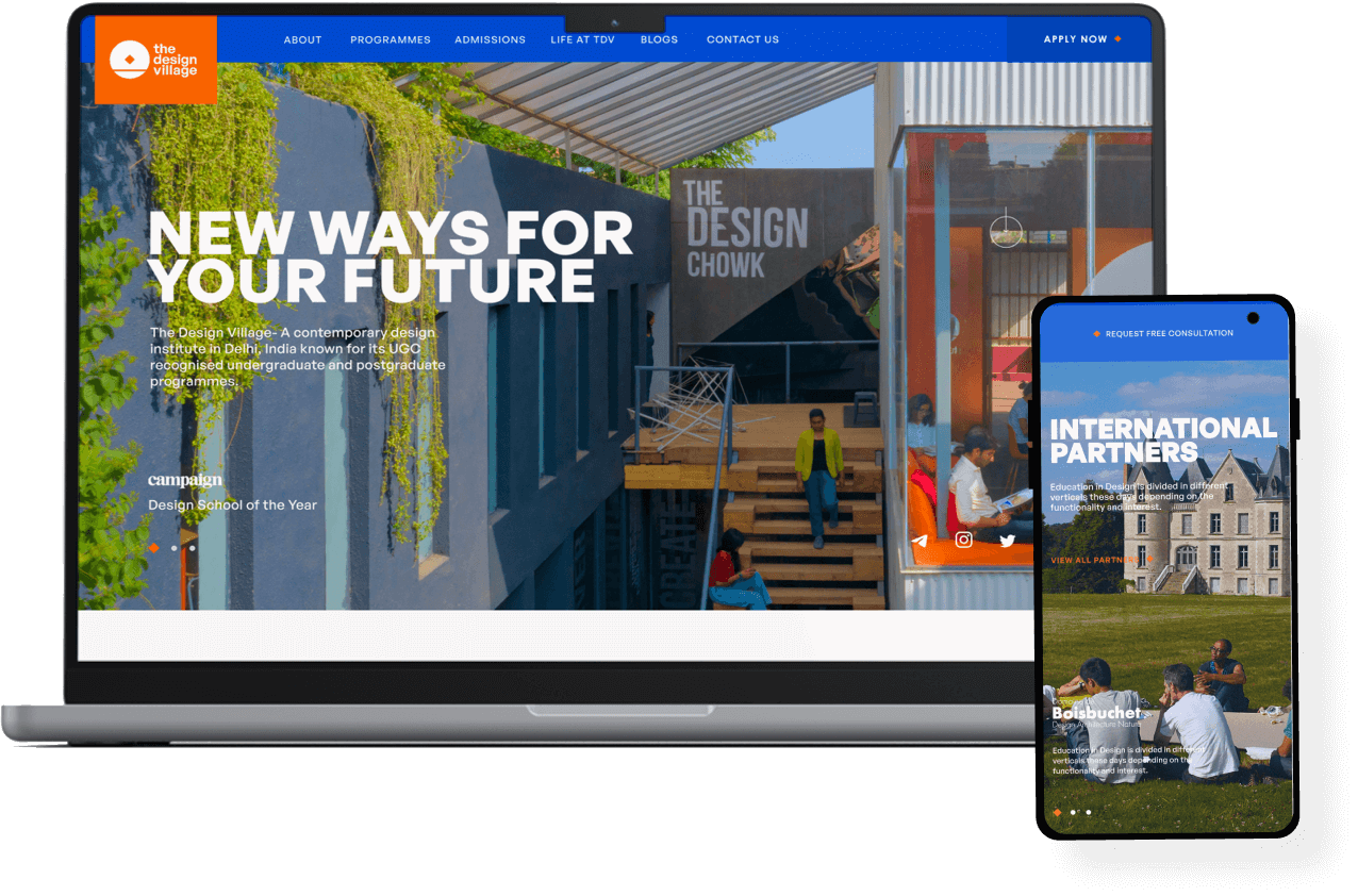
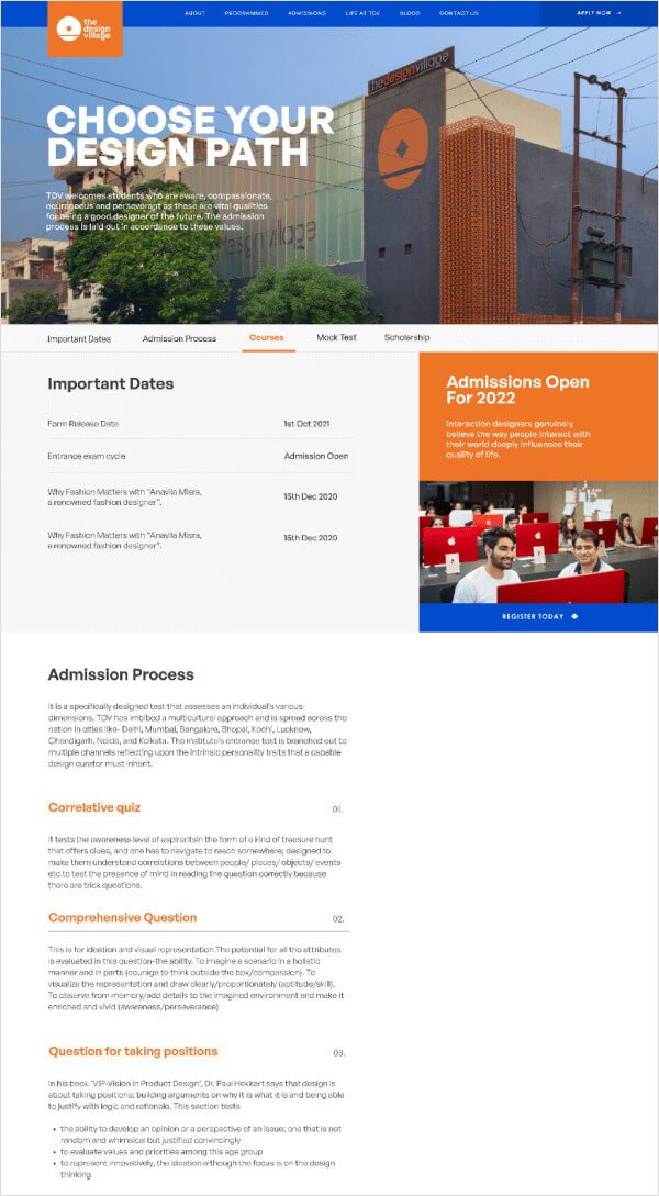
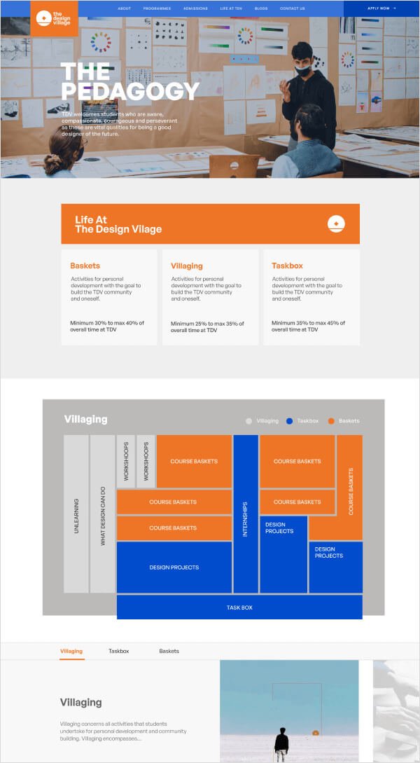
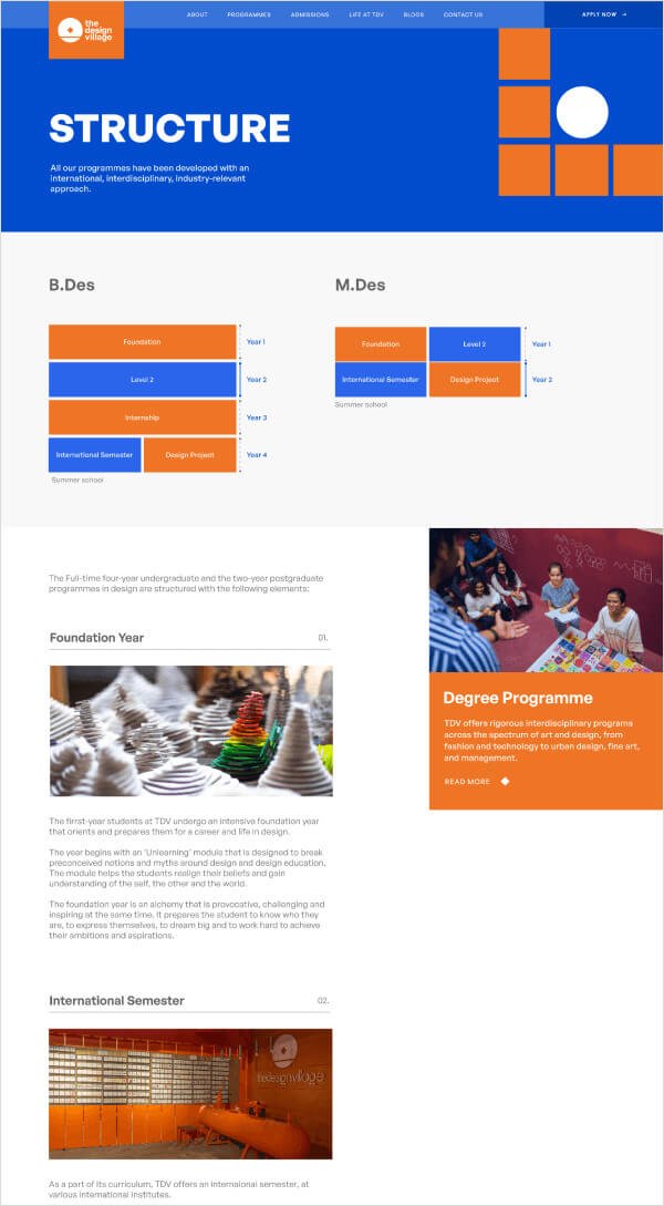
A call to action is an important aspect on any website. Call to action links and buttons act as signposts telling users what they need to do next. Without clear CTAs, users may struggle to see the route to progress further in the website. Various CTA’s we used throught the website to lead the users to the admission page.

A call to action is an important aspect on any website. Call to action links and buttons act as signposts telling users what they need to do next. Without clear CTAs, users may struggle to see the route to progress further in the website. Various CTA’s we used throught the website to lead the users to the admission page.


Final Design combines the User Interface and the User Experience. While UI lends itself to the overall style of the website(including the colors, fonts ang general look and feel), UX focuses on the actual funcationality and usability.


It’s still early days for the website, yet the results have exceeded our expectations. Since the launch of the redesign of The Design Village Website the median number of active users has increased by 45%.
Decrease in bounce rate
Increase in number of
website visitors
Increase in CTA
click through rate

Co-Founder, The Design Village
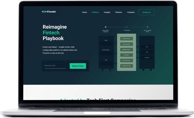
Finvolv is a dynamic digital platform for global finance institutions and banks integrated with over the top technologies and a refreshing new design.