
How about you go through this section first, so it all comes easy to you later on?
Jargon Buster:
1. Visuals
Visuals in branding refer to elements like logo, color schemes, typography, etc., that set the brand identity right along with some other vital components.
2. Visual Identity
A visual identity answers who you are and what values you uphold to your audience.
3. Brand positioning
It is structuring your brand’s image, so it earns a distinctive foothold in the industry.
4. Brand messaging
The process through which a brand conveys its value proposition and overall personality via visuals or words.
Concept of branding
Branding could confuse people. Some might find it synonymous to marketing and some might not agree with the importance of branding altogether.
Ideally, branding is all about perception.
How does your audience perceive your brand?
It’s about creating the experience, perception, or idea of your product or service that you would want your customers to have when they come in contact with your brand or think of a similar product.
Let’s first break this idea down with an illustration.
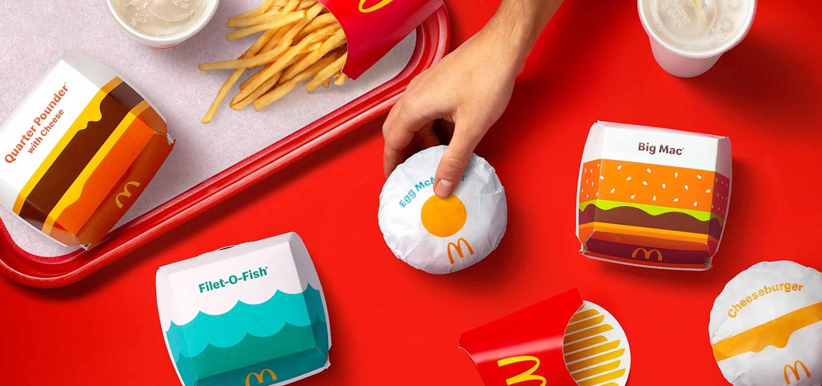
If you were craving for fries, you would think of MC Donalds, unless some other brand has taken to your taste buds. Nonetheless, you would think of similar fast-food brands like Wendy’s or Burger King.
Now go back to when we said you were craving for fries and analyse the reason any of these brands came to your mind instead of some home cooked potato fingers.
This is what makes branding a must in 2022:
1. Great branding gives your brand an easily recognizable visual identity.
Case study 1: Layton Preparatory School
A visual identity is more than a logo or the brand color scheme; it defines who you are and what your values are in a sight.
This is how strategists made a brand out of a regular family-oriented pre-school that needed a distinct positioning in the industry.
For Layton Preparatory School an appealing brand strategy was needed; one that will differentiate it from it’s competitors. The idea was to position it as a fun yet growth-centred place for kids.
The brand’s essence needed to reflect warmth and comfort for both parents and their children while conveying the brand message clearly. Hence, the logo:
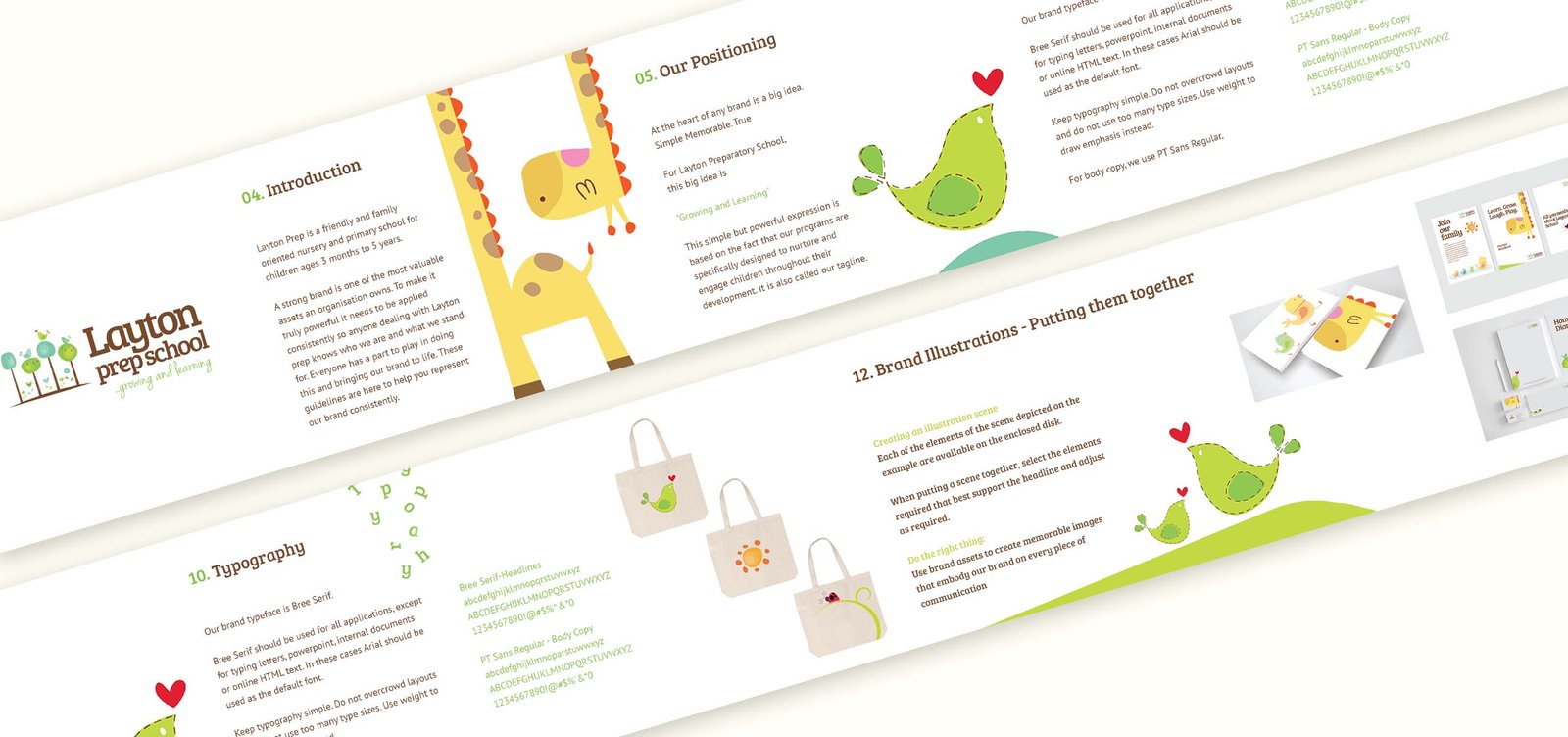
The brand positioning was done through the captivating tagline “Growing and Learning”, clearly indicating the brand’s promise of nurturing and supporting the children’s development.
The usage of illustrations gave the brand a more lively spirit and helped build a connection between the school and clients.
This way each element of the strategy contributed to a brand positioning that could speak for itself.
Results? Unlike a regular school, Layton Prep School received considerable recognition and appreciation leading to a significant increase in the number of admission queries.
Once created, your brand’s visual identity can make or break the deal. Great branding leads to an equally strong connection between your product and your target audience; any inconsistencies in the same can have a negative impact.
Case study 2: Tropicana
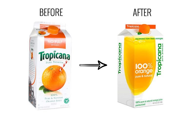
Tropicana, the much loved fruit-juice brand decided to make some changes in its packaging back in 2009. Since packaging makes up a huge part of brand identity and recognition, the changes weren’t really appreciated.
The consumer backlash on the step was so much that the company suffered a decline in sales by 20% costing around 30 million dollars within 2 months of introducing the same.
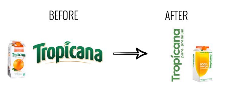
Along with the changed packaging, the company also used a vertical logo variation that was unknown to the consumers before.
So many uncalled for changes at a single time triggered scepticism in consumers regarding the product’s originality, and recognition.
Tropicana clearly underestimated the extent at which its consumer base connected with the product.
For big brands like Tropicana, changing so many brand elements at once is dicey. As it can defy the “What” & “Who” for your consumers.
2. Great branding helps build emotional connections
So is that it? Not really!
Branding is not just about what others can see and remember about you, but it’s also about what they can perceive about you.
Referring back to the example of Layton Preparatory School (case study 1), the entire build up together created an essence of a brand that is fun yet is also focused upon the wholesome development of kids.
It wouldn’t take a reasonable person a lot of time to figure out what they do and how they do it.
Similarly, through a strong brand message every brand can connect with their customers and audience on an emotional level.
Case study 3: Dollar Shave Club
The Dollar Shave Club has very simple offerings if we see it from one lense. They offer their clients grooming products, which thousands of other retailers including some big giants like Walmart and Target do too.
But does that mean that you can not top-the-charts with your offerings in a saturated market?
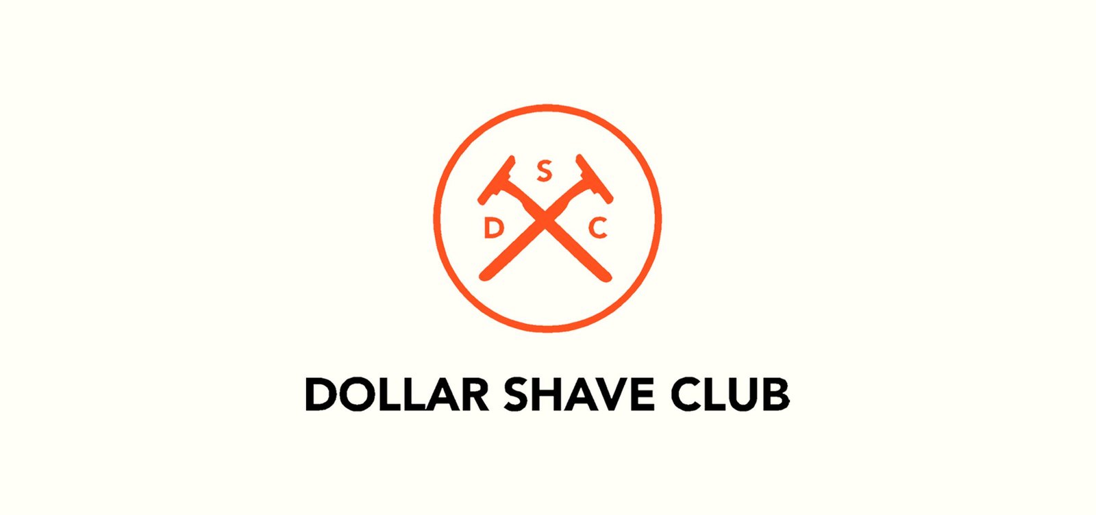
All it takes is a strategy that differentiates you well from your competitors and conveys the audience the right message.
The company positioned itself as a more convenient and pocket-friendly alternative which can also be interpreted through the tagline “SHAVE TIME, SHAVE MONEY”.
A strong brand message helped the company achieve the much needed recognition and connection within their audience.
Case Study 4: GAP

Underestimating how much your audience is connected to your brand emotionally can be a huge mistake.
GAP is known for their apparels and accessories for the last few decades and it caters to the global audience.
GAP decided to change it’s logo back in 2010 and give it a more modernised and forward looking appearance. The company’s official also explained that the whole idea was to go from the “classic American design” to “modern, sexy and cool”.
The whole logo change was considered a hasty move by consumers and industry members too. Resultantly, the company decided to go back to the original logo within a week.
The backlash was due to the overnight changes without any significant alterations in the company’s offerings or operations. While some just criticised the unsought decision, others were stuck on the old nature of the brand (plain & practical) and weren’t just ready to accept the new one.
GAP underestimated the extent to which its consumer base was connected with the brand and how the logo played an important part in building that comfort and trustworthiness for their clients.
The logo of your brand is not just a visual, it’s a touchpoint that connects your brand with your audience directly.
Moreover, raw alterations to visuals without any significant operational changes is not the right way to rebranding a brand. It’s highly essential for the change to represent a much deeper meaning and change.
3. Branding lets you sell experiences than just a product
Well there’s more.
The visuals and the message you get, but did you know the experience matters too?
Why is it that when you hear “Starbucks” you picture posh ambience, corporate people and a luxury experience altogether. Whereas, it’s the comfort and the cosiness when it comes to “CCD”.
It’s the experience and the feel they’ve sworn to offer you throughout. Sometimes, these experiences could also portray themselves as status symbols.
For instance, people don’t really buy iPhones for the features alone, they buy it to fit into a certain category of people; the status symbol that the brand offers.
Similarly when you sell experiences in spite of a product people are more likely to get addicted to them.
Think of it like this, you can jot down the best of your company’s values and promises, but how will a piece of paper make a difference unless you make sure to deliver on those values and promises.
Your brand’s customer experience is set when you live upto your brand’s essence, values, promises and everything that you claim.
Case Study 5: Maybelline New York
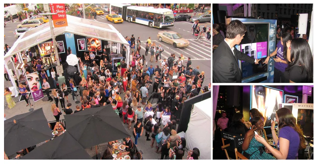
Maybelline New York is one of the global leaders in the cosmetic industry with a vast range of products for varied skin types and combinations; they’ve been a go-to brand for many since its inception.
Even after being a recognised brand, competition and changing trends were a challenge to the company. Maybelline needed its audience to accept the changes by trying the catwalk looks on the sidewalk.
The consumer base of the brand being highly invested in the glamour world was very much influenced by the fashion icons; which was exactly the experience that maybeline aimed to sell.
Maybelline launched the Colour Studio to sell the VIP experience. The studio offered product trials, makeovers and professional consultations. The same was organised on a huge scale making people aware of and open to new launches.
Maybelline in lieu of selling its name and product sold an unforgettable experience to its audience and engraved its name for a lifetime in its audience’s head.
4. Branding helps you grow.
And, of course, what is it all for in the first place if it can’t help you scale?
Branding helps reach a wider audience, spread brand awareness, increase customer loyalty and give you a distinct identity – all this so you as an organization can grow.
People buy what they think fits their definition of “me.”
Case study 6: The Beauty Co.
The Beauty Co. is yet another grooming brand for women offering a vast range of products for its audience. Although, the brand did draw a line between itself and others in the industry with the very successful #untyped campaign.
With so many beauty brands focusing on changing the true personality of the consumers by focusing on stereotypes like “fair skin,” we desperately needed an inclusive one that focused on embracing beauty as it is.
The campaign, through influencer outreach, helped people detach themselves from the typical societal tags.
Through the campaign, the beauty co. ensured their targeted audience felt valued, and inclusivity brought them a sense of belonging and comfort.
The fact that the audience was made to focus on their individuality helped them easily connect with the brand and find themselves through it.
5. Great branding builds trust.
People need an emotional connection with brands to further rely on them for their needs. When you keep up with your promises, your audience looks up to you as a trustworthy brand.
Case study7: New Balance

New Balance, a leading manufacturer of athletic shoes, has been in this industry for over a century. Since its inception, its critical plan has been to overtake the global market.
When the company launched Fresh Foam, it wanted to expand its audience and convey the brand’s authenticity to acquire a more significant percentage of the consumer segment.
Thus, New Balance decided to give the usual “testimonial game” a little twist, and instead of static testimonials and paid promotions, they decided to record first impressions of runners.
The campaign gained traction rapidly, and the results were jaw-dropping. The CTR for YouTube alone was 11%, remaining 0.44% for overall media.
New Balance knew there was no fun in the traditional testimonial game; they not only built truth within their consumer base through a rare campaign like this but also ensured people could see themselves in the shoes of those running in the campaign, literally!
Branding is much more than visuals, and we believe it must be clear to you now that you’ve gone through many case studies of renowned brands. Many will say it’s all for the “big fishes,” but the reality is that even for new businesses, branding is vital. So they can stand apart from the rest and scale without significant hurdles.